++++
I had no plans and certainly no intention of sucking my own trauma drama into the making of the cover art for the book Story Without Words as I have been posting about its process and progress recently. I am comforted by knowing that loyal readers of this blog know exactly what I am talking about when I say what I say about myself in my life. Yes, this book is about the trauma of intergenerational trauma from infant-child abuse and neglect. Yes, I did intentionally plan for the cover art work to exactly reflect the nature of the stories (crime reports) that make up the backbone of this book.
So how did THAT trauma come to be present NOW in its own sidling, intrusive and bothersome way?
++
I received further vital expertise in feedback today about Kindle publishing (and while the cheaper versions of this ereader are still in black and white, the Kindle Fire and many other ereading devices from which any ebook can be accessed and read are publishing in color). Any of this blog’s readers who are considering epublishing can benefit from what I am learning – in my own very hard way – about this process.
No, I did not envision the cover art I created so carefully, honestly, thoughtfully and hopefully for this book in its THUMBNAIL size. Nor do I know anything about marketing – and I assure you the person who wrote me the following words is an expert in the book business! The following came to me in response to a tantrum sent via email that closely paralleled my previous post on this subject – and no, I have not personally used an ebook reader.
“Okay, now that you got THAT off your chest…
Have you ever purchased (or even downloaded a free or 99c) Kindle e-book? Do you or anyone you know have a Kindle, or have you put a Kindle app on your PC? That experience will/would help you see how things look in the environment where your work is going to be viewed. The cover of ANY book is not about art, it is about marketing. If those two often-competing elements manage to compliment each other, so much the better.
There is a “cover” in Kindle-land, but unlike a conventional book it is not always the first thing a reader sees. In fact, often the reader will never see the Kindle book’s cover on the reader itself. This is because the author/editor selects the place in the book that is the “beginning”, and when someone “opens” the book, that is where they land. It can be the Title Page, TOC, the Intro, Chapter One, or whatever. It is hardly ever the copyright page, and rarely is it the cover. If the author does mark the e-book to begin at the cover, the reader is forced to page ahead to wherever it is they think is important enough to begin reading. Unlike a traditional book, an ebook reader will never finish a chapter, lay in a bookmark, close the cover, and gaze thoughtfully at the book’s colorful, intricate, and symbolic cover while the contemplate the author’s words.
BTW, how does your cover look in B&W? Do the shapes/words/designs still pop when the color is not there? This is important because the Kindle family is still B&W until you get to tablets (Kindle, iPad and others).
Final note: I’m fairly sure Amazon does not require that you use the SAME image for the itty-bitty cover thumbnail as you do for the book (i.e. the image in the ebook file that is marked “cover”). You can keep your gorgeous work of art for the book (although I think you’ll be disappointed with it in B&W, and 250 hours of works for something most readers will never see until/unless you do a print version is a shame) and just do a smaller, simpler, uglier (if you insist) version that is ONLY used for marketing on Amazon. What I think you CAN’T do is have one thumbnail image that displays on this page:
http://www.amazon.com/gp/bestsellers/digital-text/ref=pd_dp_ts_kstore_1
And when someone clicks the cover thumbnail to “Look Inside” they see a larger (but slightly/drastically different) cover:
http://www.amazon.com/Inferno-Novel-Robert-Langdon-ebook/dp/B00AXIZ4TQ/ref=zg_bs_digital-text_1
Then when they click THAT image they finally see your full-color work of art in this format:
http://www.amazon.com/Inferno-Novel-Robert-Langdon-ebook/dp/B00AXIZ4TQ/ref=zg_bs_digital-text_1#reader_B00AXIZ4TQ
You can see where it would be very confusing if the cover kept changing in each of these steps; the reader would think they accidentally got switched to a different book. That’s why I recommend a single cover version that “works” in all sizes and all environments where it is to be used.
Maybe your present image deserves a place inside the book as an illustration, if not as the cover. COVER = MARKETING, plain and simple.”
++
I also received this response from someone who knows my story and the story of my family of origin very well:
“It really depends on the viewing device. The Kindle (which is black and white) is not a good vehicle for photos, drawings, charts, etc. And yes, the cover is not promoted in any way. When you begin reading a book on the Kindle, you start on the first page. The Kindle Fire, on the other hand, is great for viewing artwork. And, if you decide, moving forward, to move to paper books, the cover becomes obviously important.
And, there are other ebook readers that might provide a different viewing experience; I have seen only the Kindle and Kindle Fire, so I’m not sure.
At any rate, it’s a beautiful, intensely personal, piece of art — heartrending, emotionally difficult, horrendous — but it came from you, from your experiences, and can be also used on your blog as a main piece.”
++
Well, I have been flying around through intense experience of all the stress response survival-based emotions today – big time.
I have so little resources in my physical world – period. Every loss – and this realistic useful information today STILL feels like a huge CRASH and a huge LOSS to me — hits me much harder than it would ‘ordinary’ kinds of people who have not been forced by circumstances of severe, chronic and horrible long-term early abuse and trauma to live such a constricted life as I have and do.
I don’t mean to whine about my life. My current conflicts are simply very real. I reacted in distress to the loss of my hoped for sense of triumph and success toward publication.
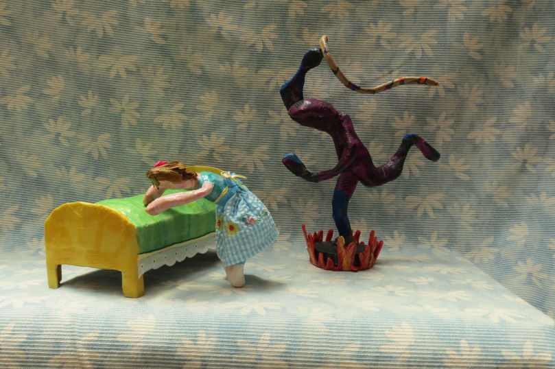
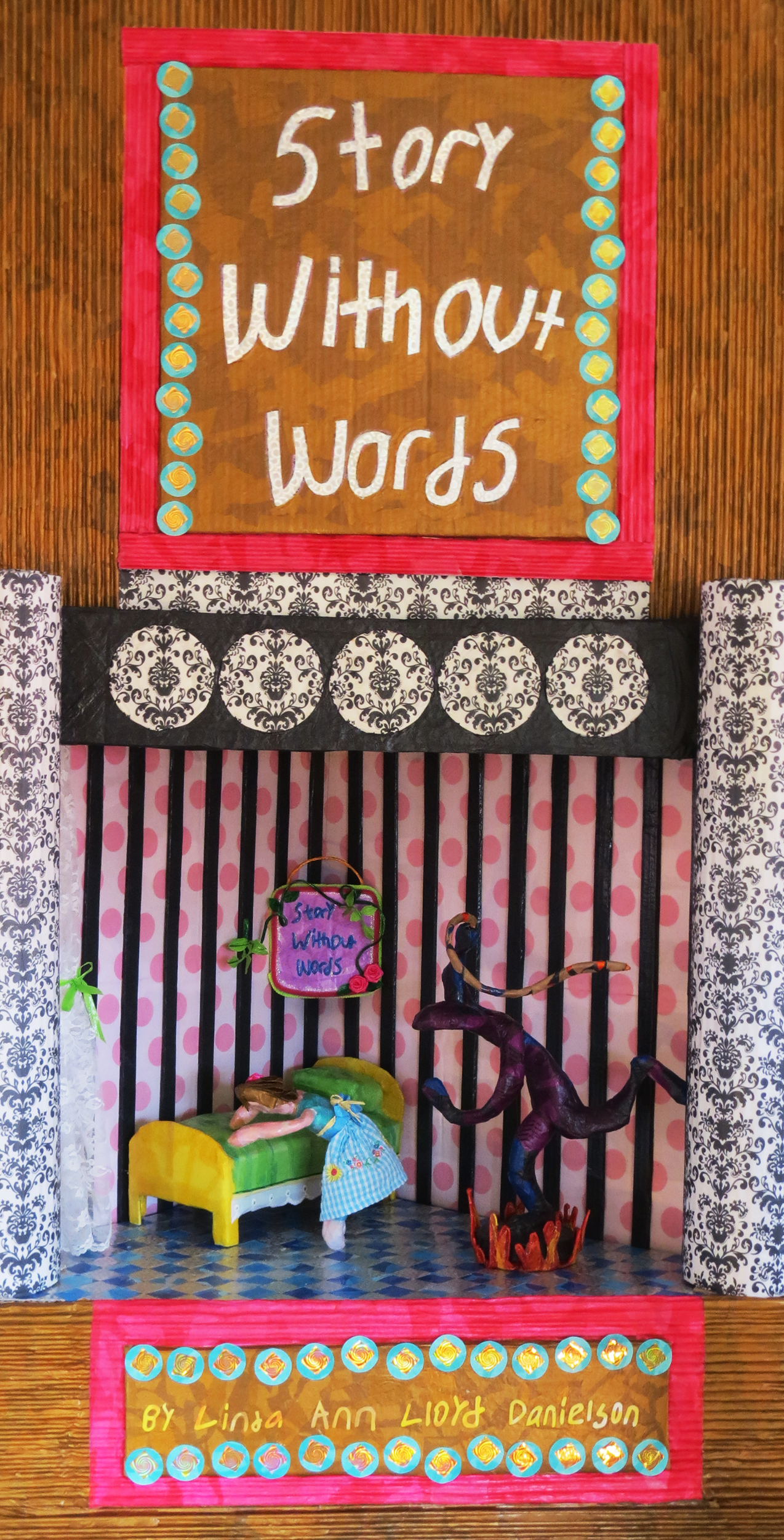
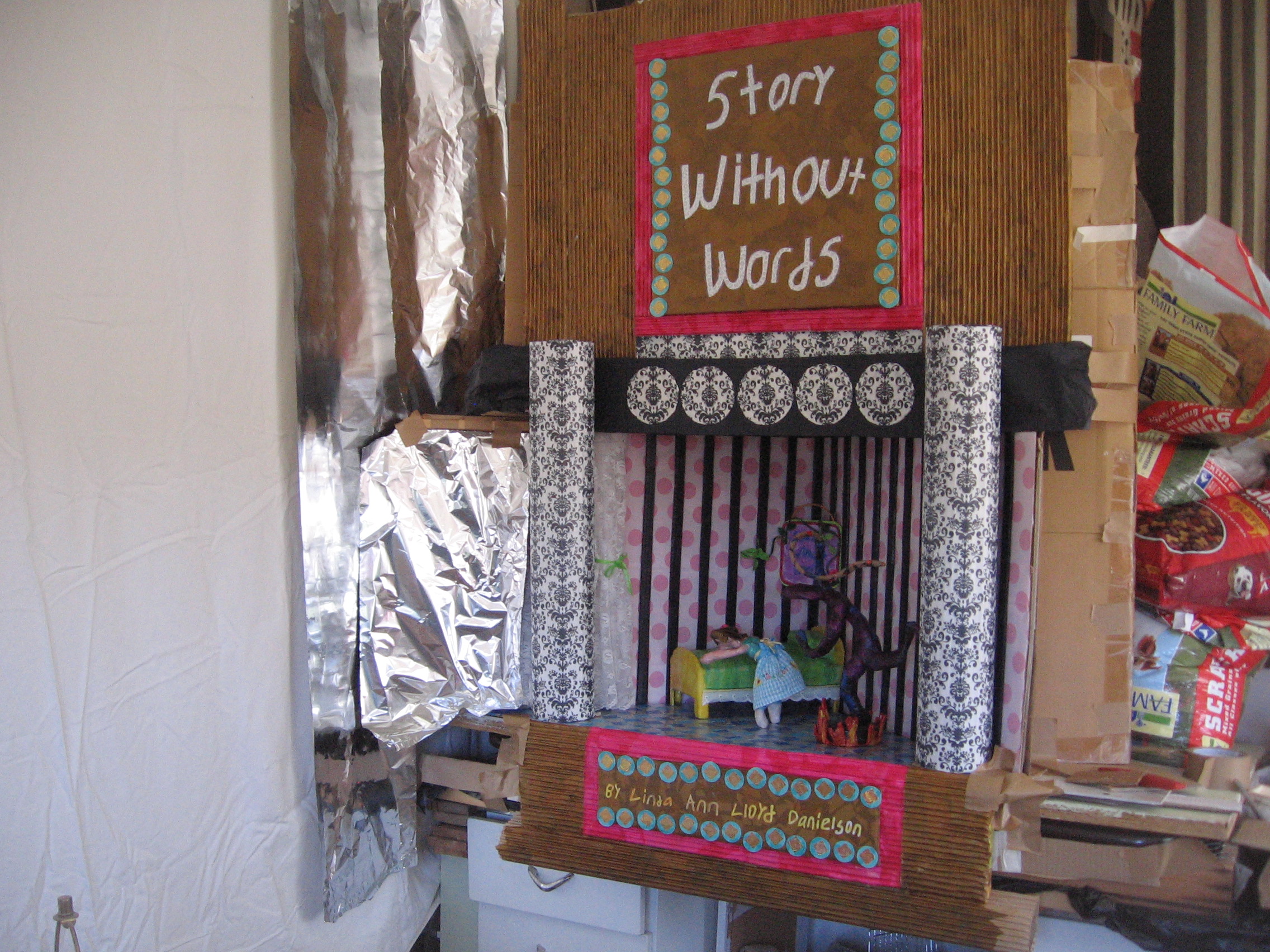
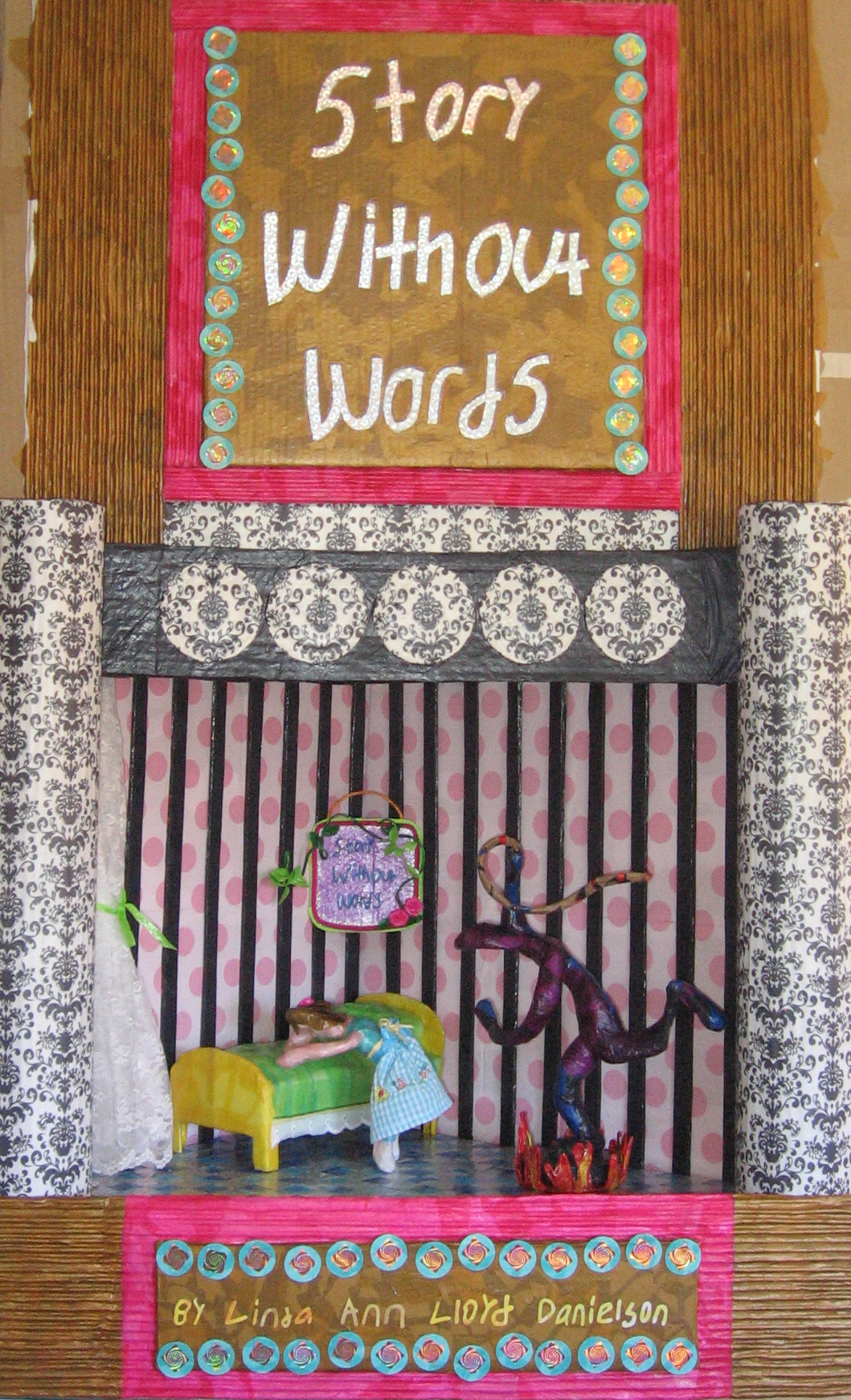
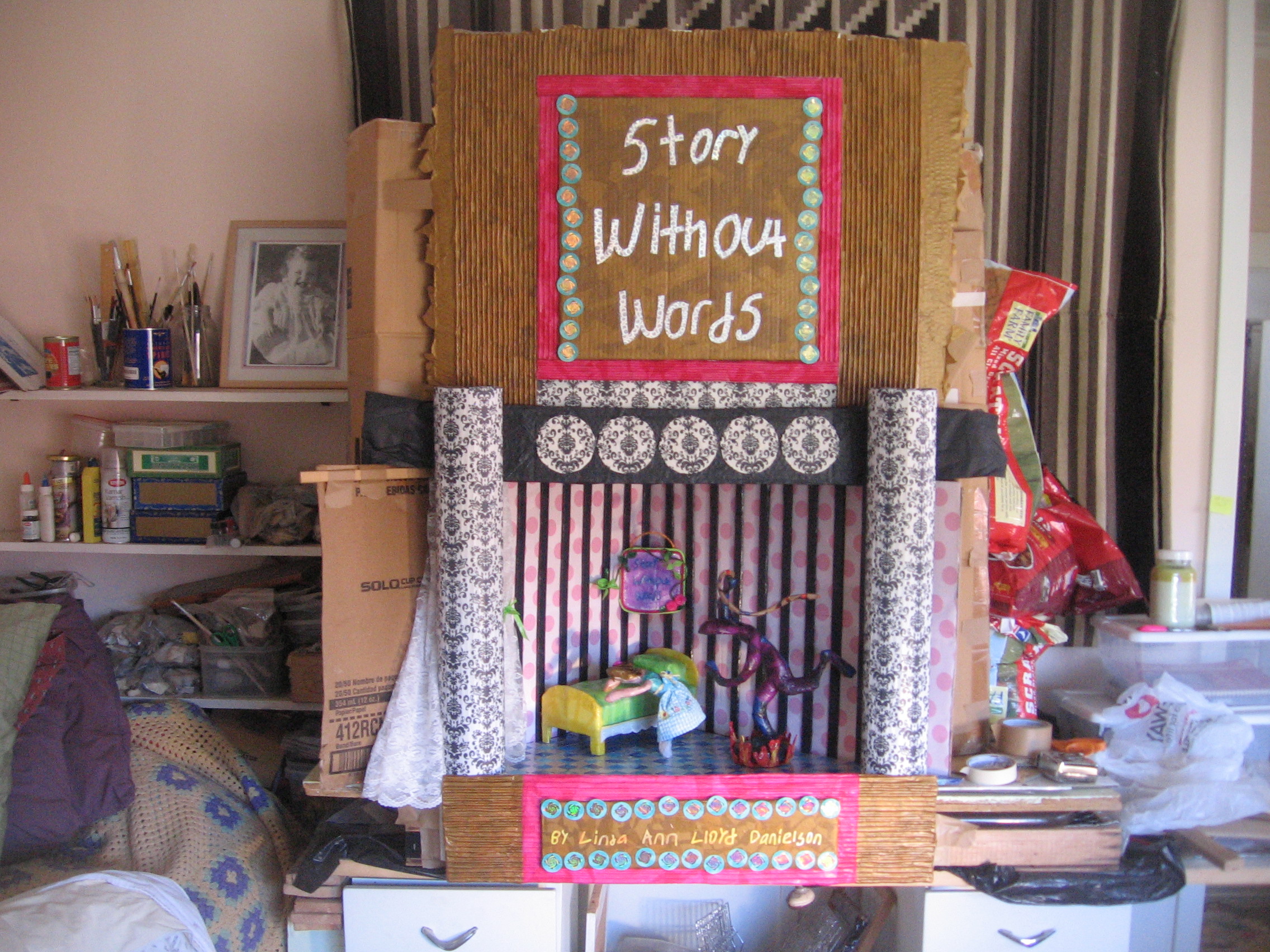
Instead – I returned to my friend’s with the super megapixel camera today (who did not remotely comprehend why my work is important to me, why I am so invested in it, or remotely why I would be distressed by the failure of the project that he so kindly helped me complete (I thought) yesterday. This photograph today is the only one of those taken of the ‘new and unimproved’ version of the suitable-for-thumbnail cover that runs in landscape (horizontal) rather than in portrait (vertical). As I have mentioned before, I have no way to crop images – they have been sent to my son and daughter for their very kind assistance in that department.
The cloth visible in this image simply runs UP and UP and UP — boringly, irritatingly, necessarily UP – so that legible lettering that can be read in a thumbnail image can be implanted upon it (This necessary version of an image can be lined up, cropped, whatever):
That’s it. That’s all I can think of. I tried my best (see last evening’s post: +BOOK COVER: WE DID IT!!!!) and it wasn’t good enough. Oh, do I know THAT feeling! I suspect most if not ALL of this post’s readers know what I don’t even have to say here about that feeling!
I also greatly struggle with affirming for myself that I have a right to have ANY of the feelings I am having today!
Yes, the cover I intended to use was made as an image meant to be “a beautiful, intensely personal, piece of art — heartrending, emotionally difficult, horrendous.” That image was created to match with integrity every word of the book itself. The cover was supposed to honor the story and vice versa.
Yet I do want to MARKET this book. This ebook.
Yet I also know that because of severe trauma during the first 18 years of my life – my brain did not develop in ordinary ways – and that includes my LEFT brain hemisphere which cannot comprehend – really – what the FACTS of marketing even are! (see: +Dr. Teicher’s ARTICLE ON TRAUMA ALTERED DEVELOPMENT)
++
I cannot explain to or describe to those who have no clue from their own personal experience of being a trauma-changed person what my state of dysregulatory REACTIVITY – of ‘disorganization’ and of ‘disorientation’ of my internal relationship with myself and with the world FEELS like in response to this massive disappointment. This IS a big deal to me. I NEED to publish.
Evidently I do NOT need to publish with my own art image on the cover of any ebook.
Health of a human being is greatly measured by our ability to flexibly and successfully cope with changes and upsets that appear in our lives — to positive resolution. Trauma altered development steals from us the ability to respond to upsetting/distressing challenges in ordinary ways. This is a very personal upset to me – of course it is! But my difficulty in COPING with it was built into me by trauma. THAT is what I hate!
I found strength for myself today by thinking that it might matter to some blog reader/s that I move forward IN SPITE of this upset – and do so successfully. So what if I feel as though I was just drop-kicked across the Grand Canyon – half way – to crash into a fall – still falling — ? Why let that feeling state stop me?
I have been truly amazed at the difficulty of my emotions today – and at their intensity!!! I wrote a piece in the 10th book manuscript that I just completed (needing edit) – that today’s experience has shown me needs one more critically important thought added to it. I would NEVER have known that piece was missing — let alone how important it is — if I had not gone through (still going through it!) exactly what happened INSIDE of me today in reaction to — well — you dear readers know exactly what I am reacting to.
Thank you for being here!! With all my heart!
++++
Please click here to read or to Leave a Comment »
++++


You must be logged in to post a comment.